
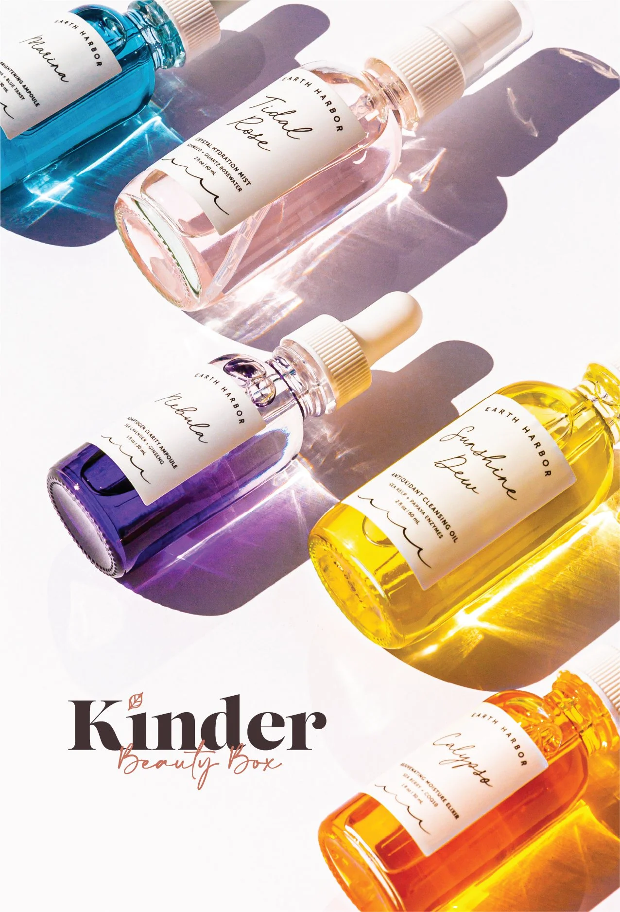
Kinder Beauty
Building a brand with room to grow.
I joined Kinder Beauty as its only designer, about a year and a half into the company’s growth. What began as a refresh of its subscription-box identity grew alongside the business itself, eventually expanding into lifestyle, proprietary skincare, and a small creative team.
Over my time at Kinder, I designed and led the brand across identity, packaging, photography, digital, campaigns, and product launches, moving from hands-on designer to Creative Director while staying closely involved in the work.
ROLE
Associate Creative Director → Creative Director
RESPONSIBILITIES
Creative Direction / Art Direction / Design / Brand Development / Packaging / Photography Direction / Campaign Development / Pre-Production / Post-Production / Creative Approval
TEAM
Rachel Kading, Design / Sophie Beierle, Email Design / Monique “Moe” Seitz-Davis, Copy / Shelby Del Vecchio-Marks, Photography
Designing beyond the box.
The existing identity was closely tied to the subscription box itself. The logo and visual language worked for what the company had been, but leadership was beginning to think beyond a single subscription model.
In conversations with our Marketing Director and CEO, we identified the need for a brand that could still feel distinctly Kinder while giving the company more flexibility to grow. I wasn't designing for specific future businesses. Those didn't exist yet. The goal was simpler: create a stronger foundation for wherever Kinder went next.
The “Before”
The Rebrand
I rebuilt Kinder around a more classic visual foundation that could feel at home in beauty without being tied to a single product or trend. I designed a new wordmark pairing a structured serif with an expressive script, then built out the palette, typography, patterns, iconography, and packaging around it.
The contrast between those two type styles became an important part of the brand. The serif gave Kinder structure and polish, while the script kept it warm, playful, and human. Depending on what we were making, we could shift the balance between the two without losing the character of the brand.




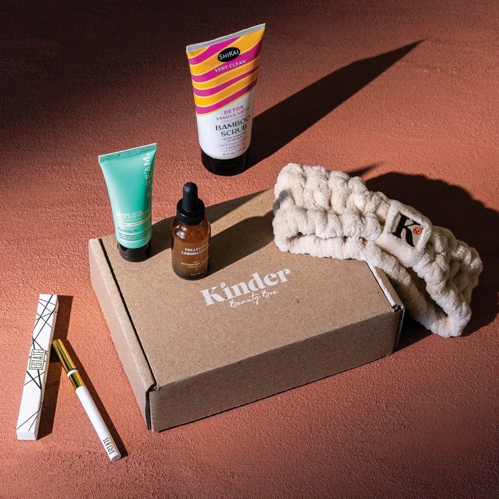
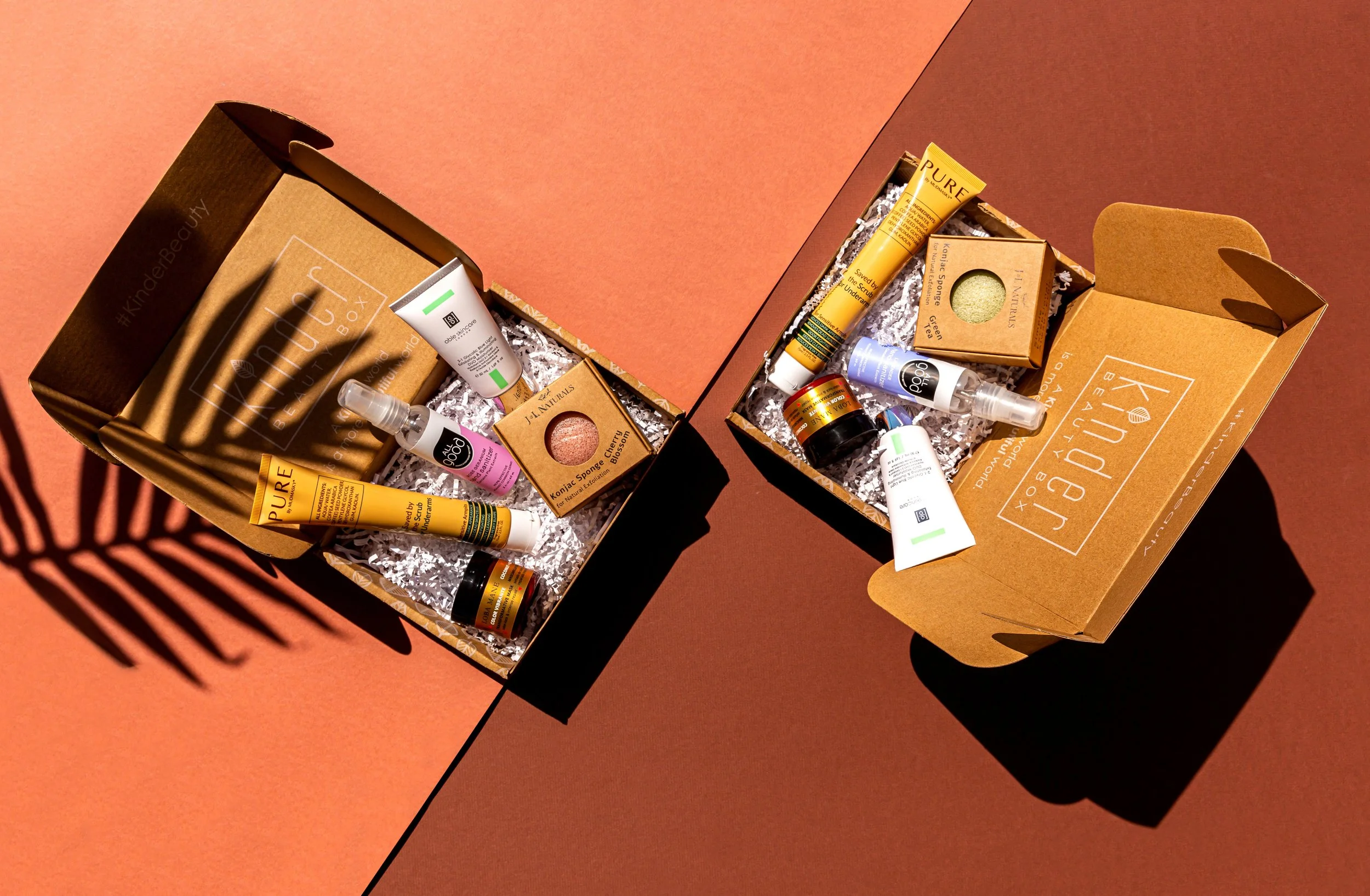
The subscription box gave the new identity its first major physical expression. I carried the system through the exterior and interior packaging, creating something that felt distinctly Kinder before a customer even reached the products inside.
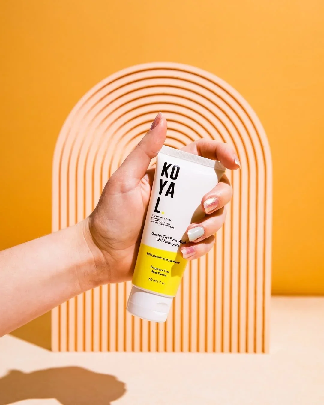
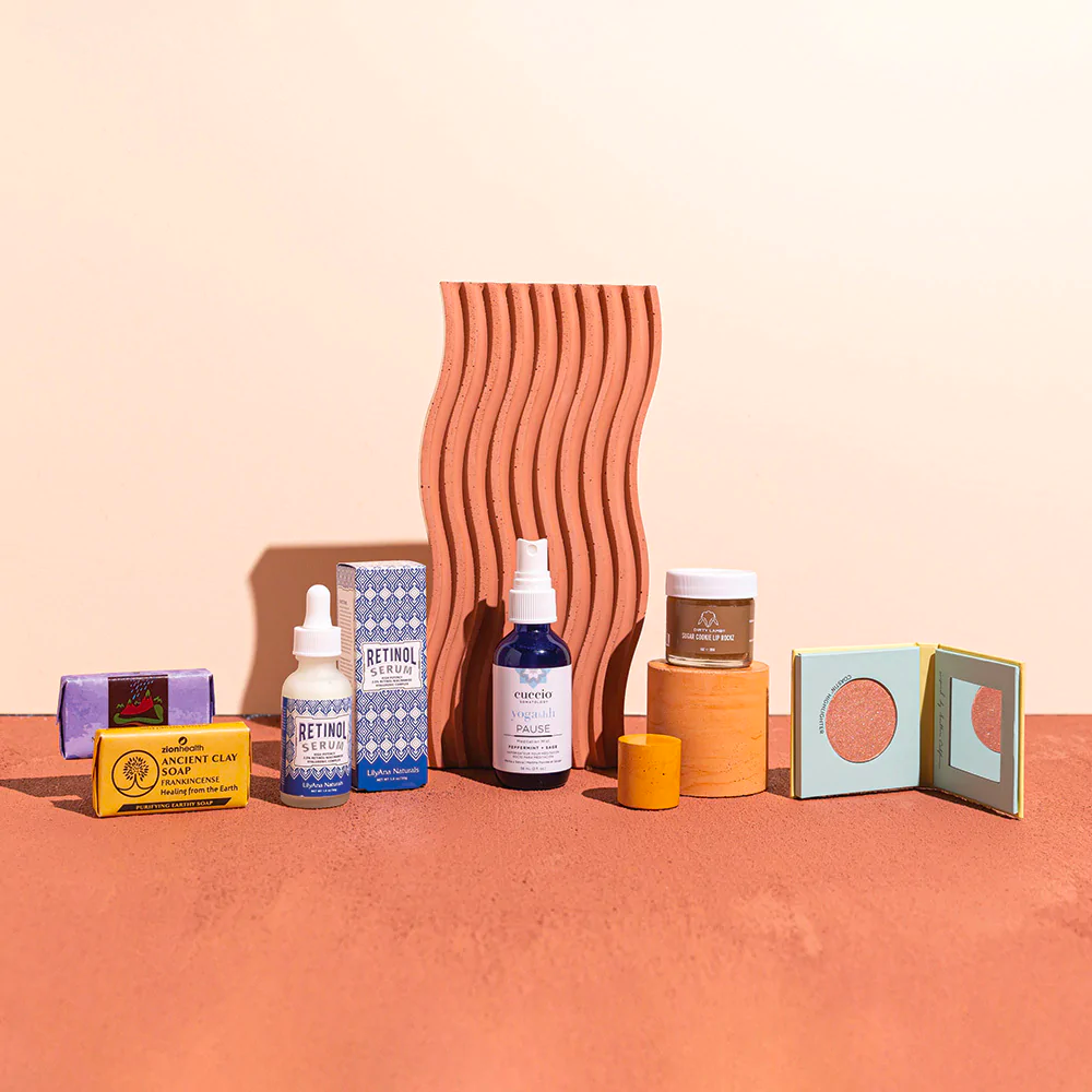
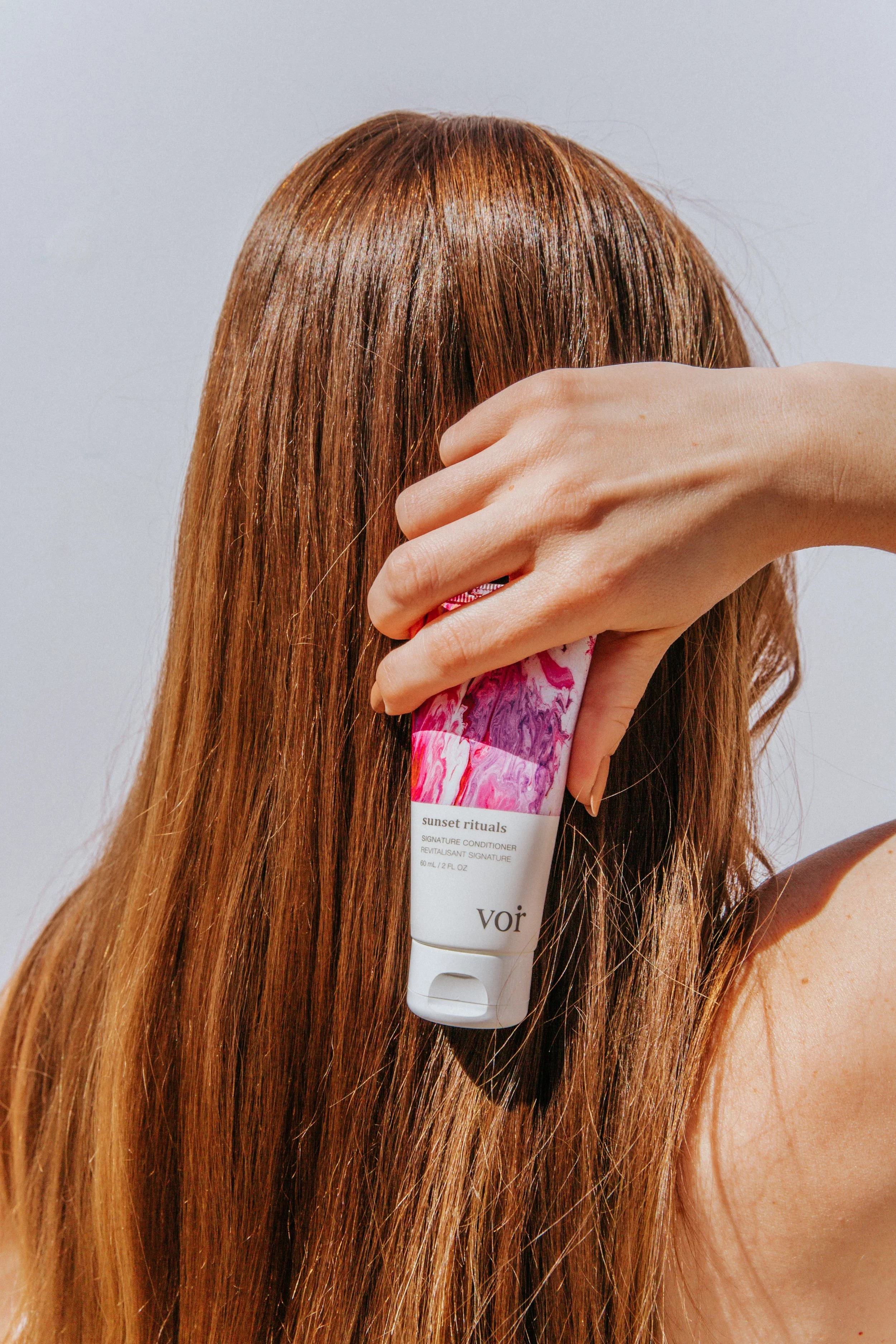
The refresh gave us a foundation, but the brand really took shape through the work we made with it. I developed the visual direction for Kinder’s photography, building concepts, moodboards, shot lists, sets, props, and color stories around each shoot. Working with photographer Shelby Del Vecchio-Marks, I directed talent and product on set, then carried the work through selects and retouching.
Photography became one of the clearest ways to express Kinder’s personality: warm, polished, playful, and unmistakably rooted in beauty.
As the brand expanded across digital, I also rebuilt Kinder’s email design and later developed the structure for its content calendar. The new approach gave us more consistency while leaving room for monthly boxes, product stories, promotions, and editorial content to feel distinct.
+2% EMAIL CTR
following the redesign and new content structure
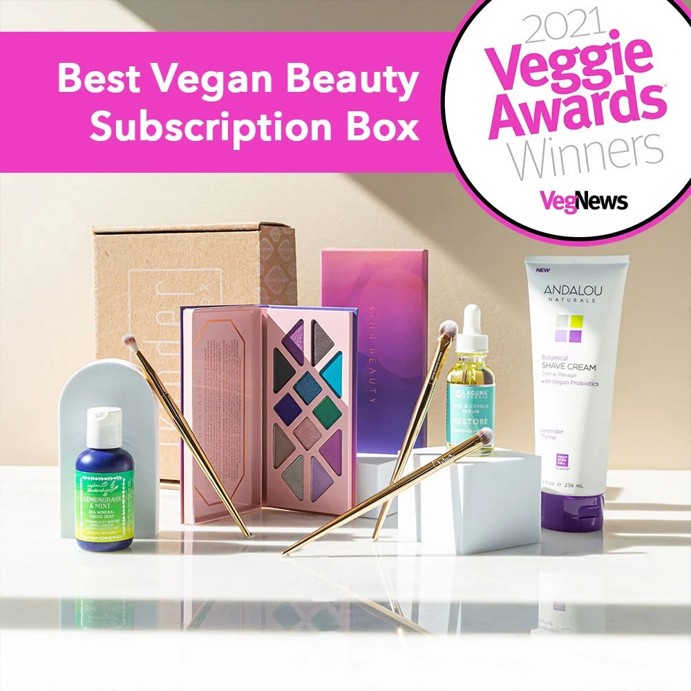
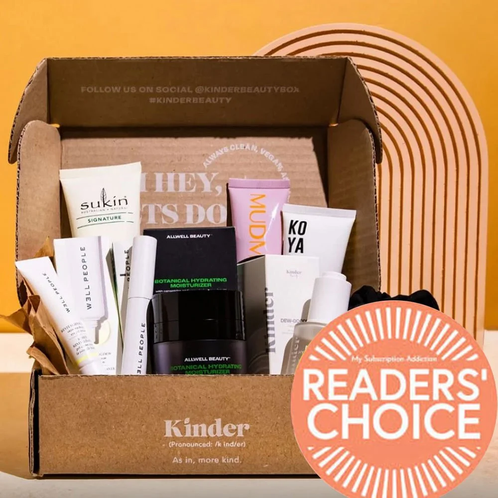
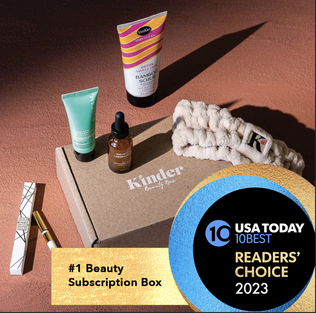
During this period, Kinder was also recognized by VegNews, My Subscription Addiction, and USA Today Readers’ Choice. I worked on the creative and design used to present the brand for award consideration.
KND by Kinder Beauty
A new side of Kinder.
As Kinder began exploring opportunities beyond vegan and cruelty-free beauty, consumer insights pointed toward an audience interested in investing more broadly in lifestyle and self-care. The opportunity became a new subscription built around products for relaxation, comfort, and everyday rituals.
While researching the language of self-care, I kept coming back to “R&R” and the idea that a few letters could hold a much larger meaning. That exploration eventually led to KND, a name that connected directly back to Kinder while giving the new brand room to develop its own personality.
I designed KND to feel richer and more restrained than the parent brand, leaning into deep jewel tones and the structured serif side of Kinder’s visual language. The result felt distinctly its own while still belonging to the world we had already built.
“The first KND by Kinder Beauty Box was another exemplary collection consisting of so many high-quality vegan, non-toxic, and cruelty-free finds.”
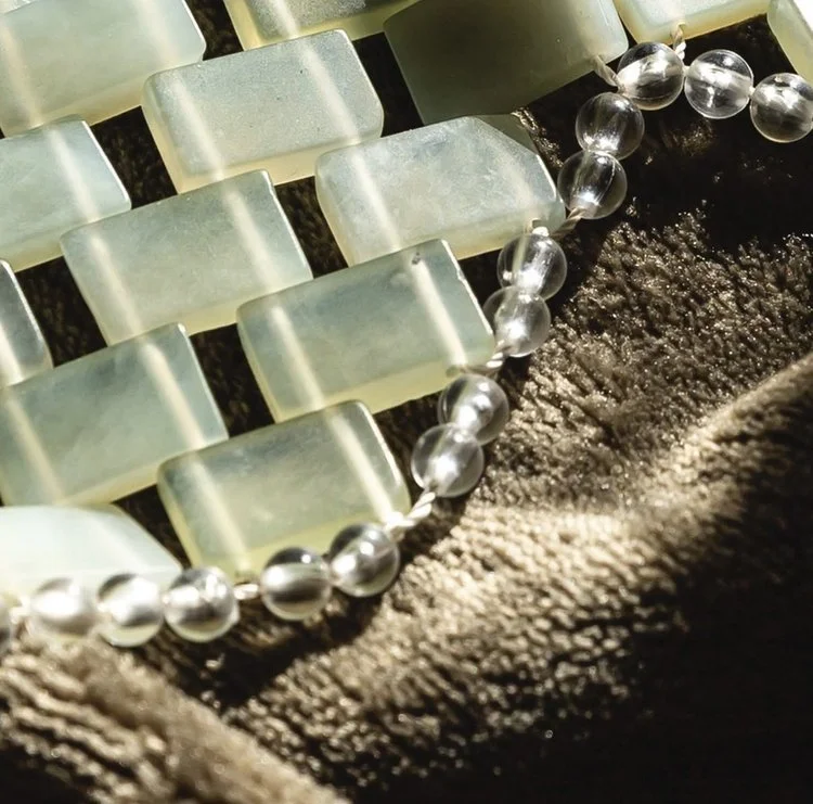
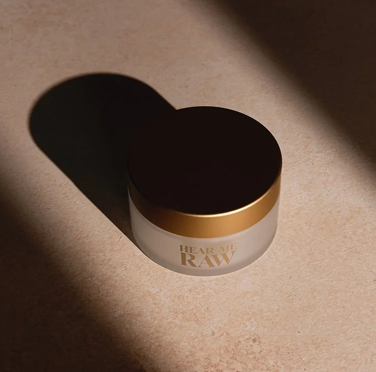
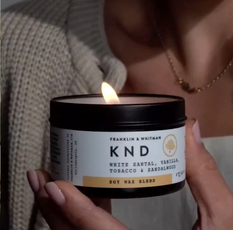
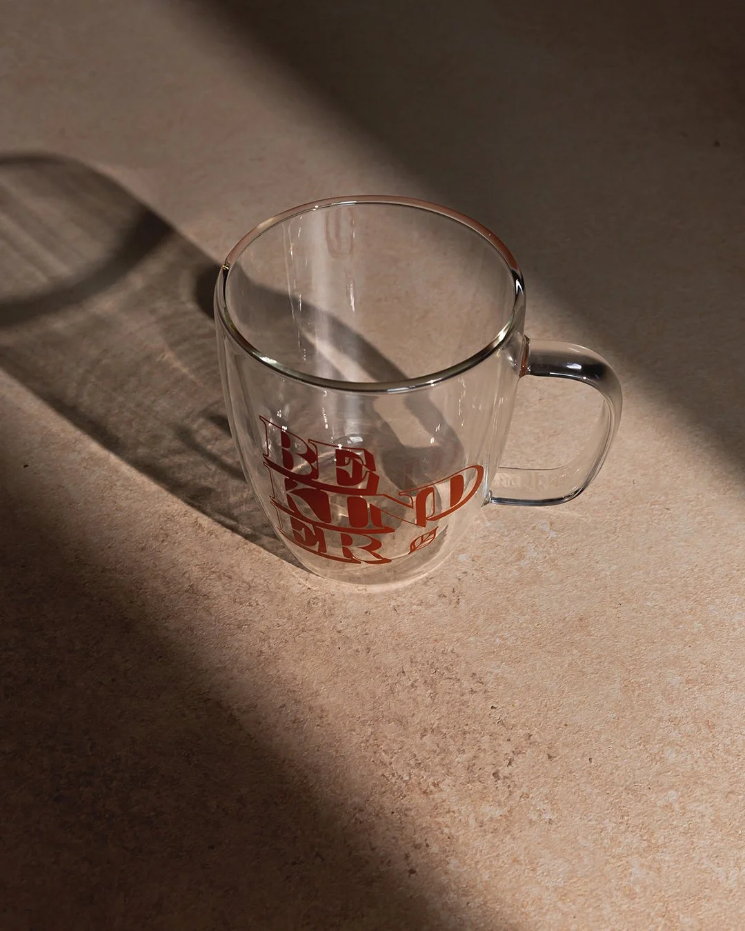
+13% MARGIN
reported within two months of launch
KND became the first opportunity to see how far the Kinder brand could move while still feeling like itself. What began as a beauty subscription had now made room for a very different kind of experience, without leaving the parent brand behind.
Made by Kinder
Putting Kinder on the label.
Made by Kinder marked another step for the business: moving from curating beauty products to creating our own. Developed in partnership with Kinder’s largest investor, the proprietary skincare line became a company-wide initiative spanning leadership, Product, Digital, and Creative.
I led the creative development of the line, using the Kinder masterbrand rather than creating a separate identity around it. The products found their own personality through naming, color, packaging, and photography, while the Kinder name remained at the center.

Building personality into the product.
Each SKU needed to communicate what the product actually did while still sounding like Kinder. I set the naming direction and brief, then worked closely with Senior Copywriter Monique “Moe” Seitz-Davis as she developed names like Dew-Gooder, Be Kind Rewind, The Bounce Back, and Hello Sunshine under my creative direction.
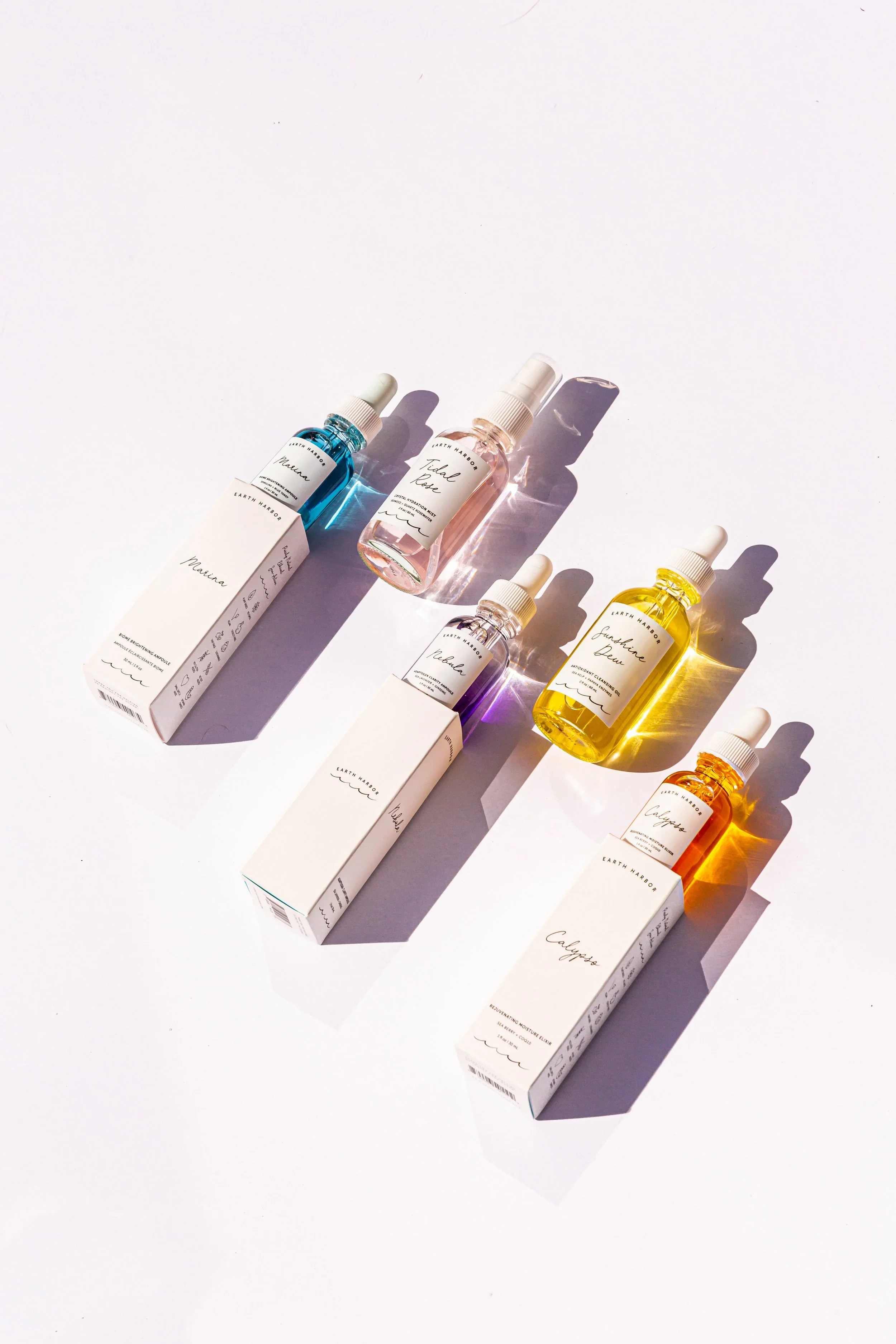
That personality carried into the packaging itself. Color helped distinguish products across the line, while the shared typography, information hierarchy, and Kinder branding held the family together.


I carried the creative direction through photography, campaign development, web, e-commerce, email, and paid and organic social, building the first launch expression for Made by Kinder across the customer experience.
~25% OF INITIAL INVENTORY SOLD IN THE FIRST WEEK
Made by Kinder was still in its early stages when I left the company, but its launch marked how far Kinder had grown from the subscription brand I first joined.
Built to grow.
I started at Kinder as its only designer, rebuilding a young beauty brand for a future we couldn't fully see yet. By the time I left, that identity had grown across subscription, lifestyle, and Kinder’s first proprietary products.
What I’m proudest of is that the brand still felt like Kinder through all of it. What began as a refresh became a visual foundation we could keep building from as the company found new places to go.